Body 4 – Card Group
Body 4 – Card Group
Description
This section has one to four cards. Each card includes a headline, short text, an optional image and link.
Fields and Character Limits
*required fields
Card Group Headline*
- Character limits: Recommended limit of 40 characters including spaces
- Help text: Enter the headline text. There is a recommended limit of 40 characters including spaces. This field renders as an <h2>. See Headers for guidelines and best practices for headlines and sub-headlines.
Image
- Limits: 2MB, 768 x 432 pixels, png jpg jpeg.
- Help Text: Move white plus icon to select your preferred focal point for automatic image cropping. See Images for guidance and best practices.
- One file only
- 2 MB limit
- Allowed types: png jpg jpeg
- Images must be larger than 768x432px
Alternative Text*
- Help text: See Alternative Text for info about writing effective alternative text.
Card Headline
- Character limits: Recommended limit of 90 characters including spaces
- Help text: Enter the card headline text. There is a recommended limit of 90 characters including spaces. This field renders as an <h3>.
Card Text
- Character limits: Recommended limit of 315 characters including spaces
- Help text: Enter the card text. There is a recommended limit of 315 characters including spaces.
Link URL
- Help text: Start typing the title of a piece of content to select it. You can also enter an internal path such as /node/add or an external URL such as http://example.com. Enter <front> to link to the front page. Enter <nolink> to display link text only.
Link text
- Character limits: Recommended limit of 30 characters including spaces
- Help text: Enter the link text. There is a recommended limit of 30 characters including spaces. Avoid link text like Click Here, Learn More and More. See Links for more info, including accessibility concerns, examples and best practices.
Available Style Options
Display Group Headline*
- Yes
- No
Background Color & Text*
- White background with Black text
- Lake background with White text
- Light Steam background with Black text
- Night background with White text
Where Can You Use This Section?
The section is available in the following templates and content types:
Templates
- Marketing
- Start
Content types
- Landing Page
Using on a cloneable Marketing or Start Template
- Locate Body 4 – Card Group in the Body area
- Select Edit
- Replace the placeholder text with the Card Group Headline
- Select Edit for each Card Group Item
- Select Remove to remove the placeholder image
- If you wish your card group to include images add an image select the Browse button to upload from your computer, or select the link Open File Browser to find a previously uploaded image
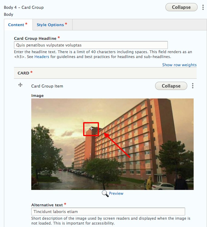
- Set the focal point by moving white plus icon to select your preferred focal point for automatic image cropping
View ScreenshotSet the focal point by moving white plus icon to select your preferred focal point for automatic image cropping - Enter the Alternative text
- Replace the placeholder text with the Card Headline and Card Text
- Replace the Link URL and Link text if you want a link. If not removed the contents of the fields.
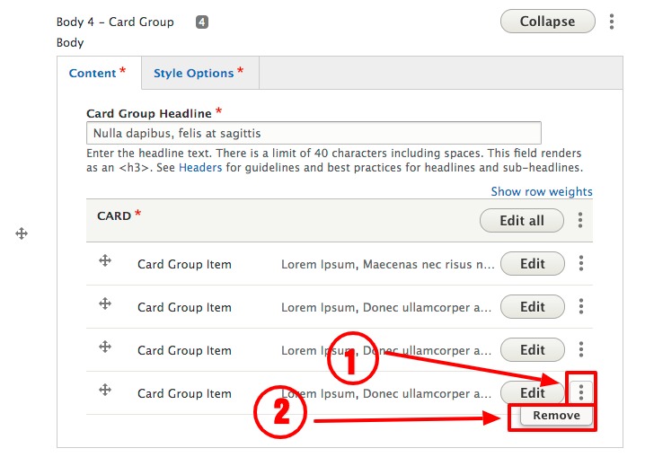
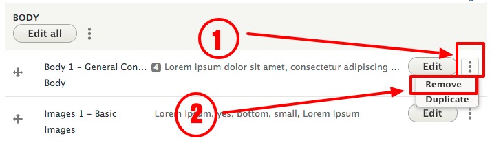
- If you would like less than 4 cards select the vertical ellipsis to the right of the Edit button and select Remove
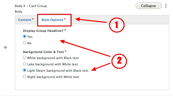
View ScreenshotIf you would like less than 4 cards select the vertical ellipsis to the right of the Edit button and select Remove - Select the Style Options tab select whether to display the Group Headline and the Background and Text Color
- Select Save at the bottom left of the page
Adding to a new Landing Page
- In the Body area, select Add Body Section
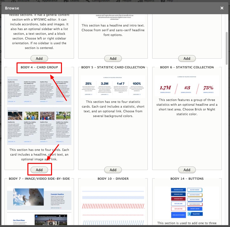
- Select Body 4 – Card Group, select Add
View ScreenshotSelect Body 4 – Card Group, select Add - Enter the Card Group Headline
- If you wish your card group to include images add an image select the Browse button to upload from your computer, or select the link Open File Browser to find a previously uploaded image
- Set the focal point by moving white plus icon to select your preferred focal point for automatic image cropping
View ScreenshotSet the focal point by moving white plus icon to select your preferred focal point for automatic image cropping - Enter the Alternative text
- Enter the Card Headline and Card Text
- If you want a link enter the Link URL and Link text
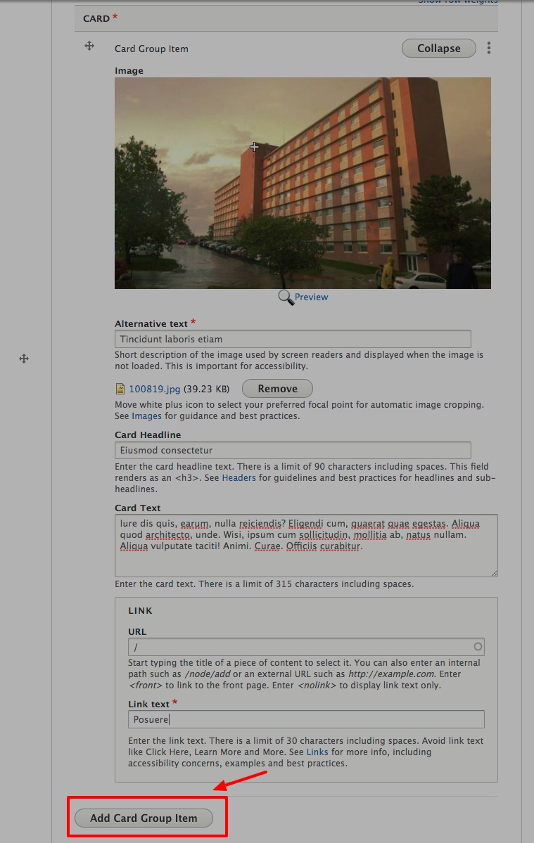
- Select Add Card Group Item and repeat steps 5 - 9 for up to 4 cards
View ScreenshotSelect Add Card Group Item and repeat steps 5 - 9 for up to 4 cards - Select the Style Options tab select whether to display the Group Headline and the Background and Text Color
View ScreenshotSelect the Style Options tab select whether to display the Group Headline and the Background and Text Color - Select either Save as Draft or Published with the drop-down menu
- Select Save at the bottom left of the form
Accessibility
- Alternative text is required for all images. See Alternative Text for info about writing effective alternative text.
- Avoid link text like Click Here, Learn More and More. See Links for more info, including accessibility concerns, examples and best practices.
Guidelines and Best Practices
- Strongly recommend using this slice only once on a page.
- Strongly recommend having images for all entries or no images for all entries
- This section allows for two to four columns with several variations for maximum flexibility.
- The section can be used to break up a page flow and draw attention to a small list of items and links.
Removing a Section
To permanently remove a section from a page:
- Select the vertical ellipsis to the right of the Edit button at the top-right of your section, select Remove
View ScreenshotSelect the vertical ellipsis to the right of the Edit button at the top-right of your section, select Remove - Select Save at the bottom left of the form