Body 14 - Buttons
Body 14 - Buttons
Description
This section is used to add one to three buttons to a page. Select from numerous button styles.
Fields and Character Limits
*required fields
Only the first button URL and Link text fields are required.
Button URL*
- Character Limits: Recommended limit of 25 characters including spaces.
- Help Text: Start typing the title of a piece of content to select it. You can also enter an internal path such as /node/add or an external URL such as http://example.com. Enter <front> to link to the front page. Enter <nolink> to display link text only.
Button Link text
- Character Limits: Recommended limit of 25 characters including spaces
- Help Text: Enter the button link text. There is a recommended limit of 25 characters including spaces. Avoid link text like Click Here, Learn More and More. See Links for more info, including accessibility concerns, examples and best practices.
Available Style Options
Button Type*
- Standard KU Blue Button
- Standard Night Button
- Standard Brick Button
- Large Lake Button
- Outline Lake Button
- Outline Fire Button
- KU Blue Outline w/Sky Shadow Button
- KU Blue Outline w/Sky Lighter Shadow Button
- KU Blue Outline w/Wheat Shadow Button
- Darker Blue Outline w/KU Blue Shadow Button
- Lake Outline w/Sky Lighter Shadow Button
- Night Outline w/Crimson Lightest Shadow Button
- Trajectory Button
Where Can You Use This Section?
The section is available in the following templates and content types:
Templates
- Basic Content
- Basic + Content
- Contact
- Marketing
- News
- Start
Content types
- Content Page
- Landing Page
Using on a cloneable Template
- Locate Body 14 - Button in the Body area
- Select Edit
- Replace the placeholder button URL and Link text
- Enter the button URL and Link text for additional buttons
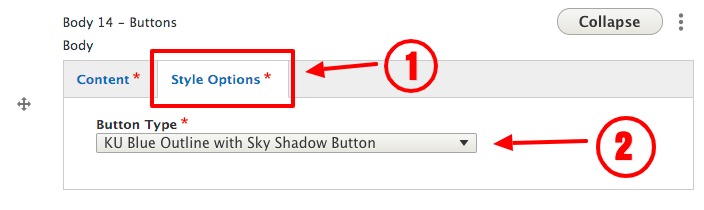
- Select the Style Options tab to select the button style
View ScreenshotSelect the Style Options tab to select the button style - Select Save at the bottom left of the page
Adding to a new Content or Landing Page:
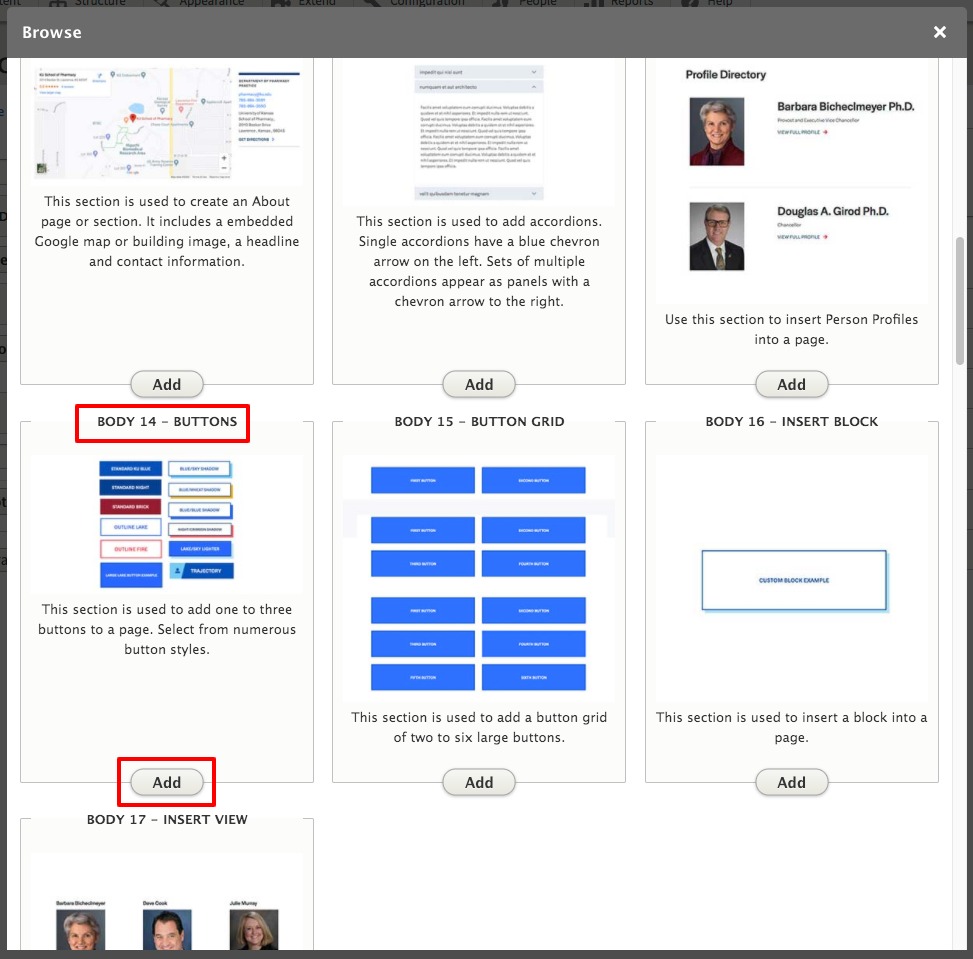
- In the Body area, select Add Body Section
- Select Body 14 – Button, select Add
View ScreenshotSelect Body 14 – Button, select Add - Enter the button URL and Link text
- Select the Style Options tab to select the button style
View ScreenshotSelect the Style Options tab to select the button style - Select either Save as Draft or Published with the drop-down menu
- Select Save at the bottom left of the form
Accessibility
- Avoid link text like Click Here, Learn More and More. See Links for more info, including accessibility concerns, examples and best practices
Guidelines and Best Practices
- Button text is limited to 25 characters including spaces.
- This section is used to insert a button when needed to stand alone.
- If your button needs supporting text or imagery consider using a CTA or List section.
- If you need more than 3 buttons you should consider using a button grid.
- Use Body 15 - Button Grid if you need to display more than three buttons.
Removing a Section
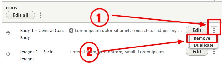
To permanently remove a section from a page:
- Select the vertical ellipsis to the right of the Edit button at the top-right of your section, select Remove
View ScreenshotSelect the vertical ellipsis to the right of the Edit button at the top-right of your section, select Remove - Select Save at the bottom left of the form